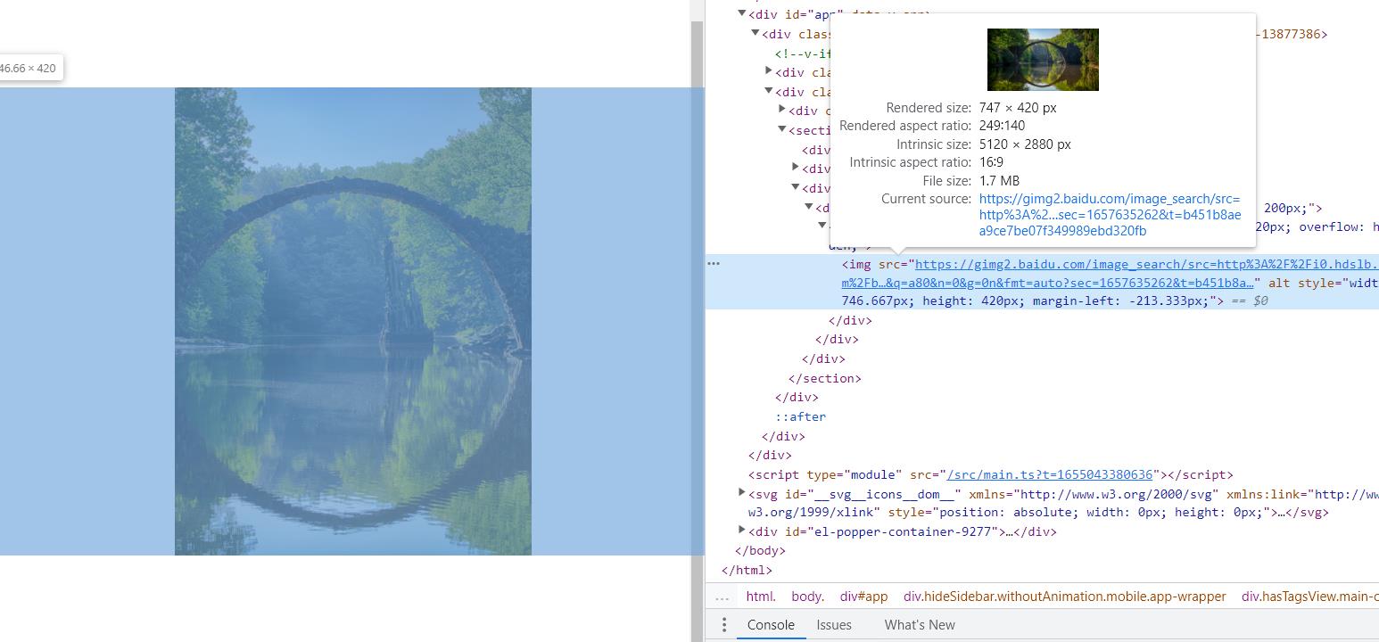
开发项目过程中,很多时候要将图片缩放显示到父节点/父元素中,并且要清晰不能变模糊,缩略图就经常用到,所以就需要等比例缩放图片,一种方式是cover,图片缩放至铺满父元素并居中,一种是contain模式,图片全部显示在父元素,并居中显示;
之前是用js的方式实现,现在发现用css也可以实现:
这些需求在jQuery时代也写过:
如今vue时代,同样有这种需求,好吧,直接上vue版本:
export default{
    directives:{
        imgscale:{
            inserted(el, binding, vnode){
                let isJson = (obj)=>{
                    return typeof obj ==='object' && Object.prototype.toString.call(obj)=="[object Object]"
                }
                let imgScale = (options)=>{
                    let defaults = {
                        imgWidth:el.width,
                        imgHeight:el.height,
                        panelWidth:el?.parentNode?.offsetWidth,
                        panelHeight:el?.parentNode?.offsetHeight,
                        scale:!binding?.modifiers?.stop,
                        resizeType:binding?.modifiers?.contain?"contain":"cover",
                        unit: 'px'
                    }
                    options = isJson(options)?options:{}
                    options = Object.assign({} ,defaults, options || {})
                    console.log(options)
                    if (options.scale) {
                        if (options.imgWidth > 0 && options.imgHeight > 0) {
                            el.parentNode.style.width = options.panelWidth+options.unit
                            el.parentNode.style.height = options.panelHeight+options.unit
                            switch(options.resizeType){
                                case "cover":
                                    // 默认 cover 方式,处理后的宽或高超过容器的宽高,用margin负值使之上下或左右居中
                                    // 如果图片比容器扁
                                    if (options.imgWidth/options.imgHeight >= options.panelWidth/options.panelHeight) {
                                        let toWidth = options.imgWidth * (options.panelHeight / options.imgHeight)
                                        el.style.width = toWidth+options.unit
                                        el.style.height = options.panelHeight+options.unit//等比缩放,保持清晰度
                                        el.style.marginLeft = -((toWidth - options.panelWidth) / 2)+options.unit
                                    }
                                    // 如果图片比容器瘦
                                    else {
                                        let toHeight = options.imgHeight * (options.panelWidth / options.imgWidth)
                                        el.style.width = options.panelWidth +options.unit
                                        el.style.height = toHeight+options.unit//等比缩放,保持清晰度
                                        el.style.marginTop = -((toHeight - options.panelHeight) / 2)+options.unit
                                    }
                                    break
                                case "contain":
                                    // contain方式,处理后的宽或高不足容器的宽高,用margin正值使之上下或左右居中
                                    if (options.imgWidth/options.imgHeight >= options.panelWidth/options.panelHeight) {
                                        let toHeight = options.imgHeight * (options.panelWidth / options.imgWidth)
                                        el.style.width = options.panelWidth+options.unit
                                        el.style.height = toHeight+options.unit
                                        el.style.marginTop = ((options.panelHeight - toHeight)/2)+options.unit
                                    }else {
                                        let toWidth = options.imgWidth * (options.panelHeight / options.imgHeight)
                                        el.style.width = toWidth+options.unit
                                        el.style.height = options.panelHeight+options.unit
                                        el.style.marginLeft = (options.panelWidth - toWidth)/2)+options.unit // 容器已居中
                                    }
                                    break
                            }
                        }
                    }
                }
                //已经加载过了
                if(el.complete && el.width>0){
                    imgScale(binding.value)
                    return
                }
                //没加载过则监听load事件
                el.addEventListener("load",()=>{
                    imgScale(binding.value)
                }, false)
            }
        }
    }
}
参数说明:
/**
* @method 图片等比例缩放居中显示
* @example
* <img v-imgscale.cover.stop="options" />
* @param cover 修饰符,缩放类型:图片在父元素中怎么放置,cover表示缩放至铺满父元素并居中, contain表示图片缩放至能在父元素看到图片所有内容并居中,具体可以参考css中background-size的 cover/contain值
* @param stop 修饰符,有stop(true)修饰符代表不处理图片;
* @param options :{
    imgWidth: {Number} 图片的宽度,默认单位px
    imgHeight: {Number} 图片的高度,默认单位px
    panelWidth: {Number} 图片容器的宽度,默认单位px
    panelHeight: {Number} 图片容器的高度,默认单位px
    scale: {Boolean} 是否缩放
    resizeType:{String} = contain | cover 缩放类型
    unit: {String} 宽高的单位,默认"px"
* }
* @description 实际应用中以上参数中的宽高值,指令都会默认获取,但手动配置的优先级最高
*/
使用例子:
1、普通用法:
<div style="display:inline-block;width:220px;height:220px;overflow: hidden;">
    <img v-imgscale src="/images/test.jpg" alt="" />
</div>
2、图片列表:
<div v-for="item in array" style="display:inline-block;width:220px;height:220px;overflow: hidden;">
    <img v-imgscale  :src="item.src" :key="item.src" :alt="item.alt" />
</div>
3、修饰符.cover | .contain
<div style="display:inline-block;width:220px;height:220px;overflow: hidden;">
    <img v-imgscale.cover src="/images/test.jpg" alt="" />
    <img v-imgscale.contain src="/images/test.jpg" alt="" />
</div>
4、修饰符.stop
<div style="display:inline-block;width:220px;height:220px;overflow: hidden;">
    <img v-imgscale.stop src="/images/test.jpg" alt="" />
</div>
4、指令绑定值:options
<div style="display:inline-block;width:220px;height:220px;overflow: hidden;">
    <img
        v-imgscale="{
            imgWidth: 920,
            imgHeight: 520,
            panelWidth: 120,
            panelHeight: 120,
            resizeType: 'cover'
        }"
        src="/images/test.jpg"
        alt=""
    />
</div>